Corktown Logo Design Contest
Entered an accessible design into Corktown's Logo Design Contest with the following text to explain its flexibility and its tie to Corktown's multicultural history.
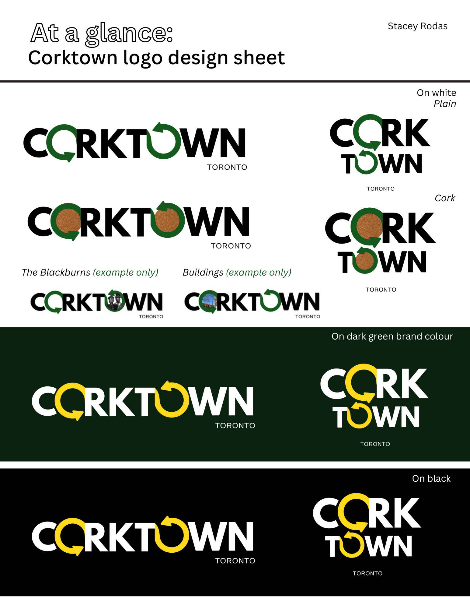
About the logo:
Corktown is such a pivotal part of Toronto's past, present, and future, as the Association so eloquently described in the design brief.
This simple yet eyecatching logo, which was inspired by the brief, represents the cycle of forward change and renewal while appreciating all aspects of our shared past. From its Indigenous, Black, and Irish roots to its present day form and future plans, Corktown forever moves forward while also looking back. The two "O Arrows" in the logo most certainly remind us of this.
I have provided a couple examples using local imagery of The Blackburns and surrounding buildings, but they are low-resolution and I do not own rights to either of those photos, thus those ones are for reference only, not for use.
It is recommended that in order to keep a clean look, only one "O Arrow" is filled at a time with imagery. Filling both may be distracting to the eye. You can have endless variations recognizing the present/future in the first forward-pointing "O Arrow" and the past in the second backward-pointing "O Arrow".
I felt it was important to add TORONTO below Corktown in case folks from out of town are purchasing merch, but it can be cropped out easily or removed from the design altogether.